Quotables

But what do I know? I'm just a twice clicken brown shirt teabaggin tjroll. Right? --PatP

Not now. There are dirty, swaying men at my door. They’re looking for Brian. I need to go deal with that. --Thor

If Joss Wedon was near me, I'd of kicked his ass. --PaulC

Saturday, January 22, 2011

duck song

So…. Here. Watch this.

Now watch this.

And finally, here ya go: part three. This one’s different. I promise.


So I was on tinychat with some folks from Kongregate and one thing lead to another, tits were shone, and a guy had to sing a song. So he started the Duck Song video and sang along with it. It was funny. So I thought I’d share that magnificence with you all. Enjoy the Duck songs.

Monday, January 3, 2011

The Matrix?

I just finished watching The Matrix Trilogy. Wow. I forgot how badly it sucks. Lemme splain. First movie: awesome. I’ll watch it any time you want. Second movie: ditto. Adds some really interesting stuff to the story and makes it more interesting. Third movie: f*#$ing awful. Every bit as bad as Attack of the Clones, but for somewhat different reasons.

First, let’s begin with the premise of the entire series. Why does the Matrix even exist to begin with? Human beings don’t need to be awake to produce body heat and electricity, which is why the machines need us. So why not do what the Tleilaxu do to their axlotl tanks and chemically lobotomize them to keep them in a vegetative state? For that matter, why bother with human beings at all? Why not use moose? Or whales? Both bigger than humans and therefore produce more heat. Why bother with the crumbs when you can have the feast?

Okay. Setting aside the fact that the Matrix serves no purpose, let’s move on. Neo, as explained by the architect, is the inevitable result of the mathematical process that is the Matrix. That in itself necessitates that Neo is not a real person. He’s a mathematical quantity. He’s a computer program, just like Smith. Coupled with the fact that he retains his superpowers outside of the Matrix, the only logical explanation is: Matrix squared. Matrix within a Matrix.

Again setting aside the fact that the existence of the Matrix makes no sense whatsoever, let’s assume that the purpose of the Matrix is as explained: keep humanity docile. make us believe everything is as it should be. Wouldn’t it be absolutely essential to have a redundancy? Do you really suppose that a machine society would not deal with humanity under the basic principle of “shit happens”? Life is unpredictable, so you need to account for every possible eventuality, including the possibility that the humans you missed in the first place are going to mount a resistance. Or, in this case, since we didn’t miss any, that they will somehow discover what’s going on. So: let them escape. They’ll think they’ve won. Only they haven’t, because they’re still in the over-matrix.

If that’s not the case, how the hell does Neo have superpowers outside the Matrix?

Next: Neo kills Smith, and dies in the process. Exactly what motivates the machines to not destroy Zion? The fact that the made a deal?! Are you f*&%ing kidding me?! You don’t not destroy the one thing that could possibly destroy you because you made a deal with it. Well, maybe a person does, because a person understands things like honor and friendship. Computers don’t have friends. They have “others with whom they interact,” and they don’t do anything just because they said they would. That is completely and utterly ridiculous. They say what they need to say to get their adversaries to do what they want, then strike when they’re weak.

So… I dunno. I just felt the need to vent, and here’s as good a place as any.

Thursday, December 30, 2010

my awesome hair

So I frequent Kongregate. I have, on occasion, had reason to post links to this blog in chat there. I don’t remember what the reason was, but a week or two ago I posted links to my self-portraits and my photoshop post. Whatever. “Nice pics” seemed to be the catch-phrase of the day.

Here we are, at least a week later, and I’m chatting again on Kongregate. Some guy questions my grammar (not what I said, but how I said it). So I politely said “don’t f*** with me. I’m an English teacher.”

A lie, yes. But I always feel justified in it, and not just because it shuts most people up faster than saying I’m a Jehovah’s Witness.

Getting back to the story: So somebody else says “Thor has awesome hair tho...have you looked at his blog???”

That was the most gloriously gratifying moment of my life. Ever.

I suppose I will be more gloriously gratified when my teenage son looks at these photos (if fifteen or so years, when I have a teenage son) and says “damn dad. You even had great hair back then,” but until then I find it hard to believe that anything will come close.

Thursday, December 9, 2010

Photoshop Assignments

I just sent off the last of my photoshop assignments for the semester, and thought I would share with you some of the fun ones.

Here’s a photo of the hallway on the third floor of the Graphic Arts building.

hallway

See that second window? Watch this.

vanishing point

That was a lot more fun than it looked. Here’s my after-action report (handed in with the finished product five minutes ago).

First, I opened the hallway photo in lightroom (if you don’t know what Adobe Lightroom is, you owe it to yourself to find out) to adjust the lighting. I could have used photoshop's camera raw dialogue, but the lightroom interface is much more user-friendly.

Once I was satisfied with the levels, I opened the image in Photoshop and created a vanishing point grid, using the corner between the wall and the floor, as well as the corner of the wall and the ceiling for reference. I then used a combination of the patch tool, heal brush and spot heal to brick up the window.

Next I did a google image search for "framed Mona Lisa." I found a high-resolution image, which I then pasted onto the vanishing point grid. I shrank it a little, but I don't know how big the Mona Lisa actually is, so I made it look as big as a painting.

Once I had the painting positioned on the wall, I used the "fx" button on the layers panel to add a drop shadow. Finally, I used the curves dialogue to adjust the light on the painting. It still looked a little unnatural, so I used the brush tool at an opacity of 40 and a color of 64 grey (in darken mode) and went over the entire painting once.

Since there are undoubtedly those of you who don’t know what a “vanishing point grid” is, here’s the one I made for this project

vanishing point

It’s a grid that not only serves as a guide for you, but also tells photoshop how to render things like… paintings that you just pasted into the image. So instead of this project taking five hours of mind-numbing skewing and transformations, it took about five minutes to setup the grid, roughly nine seconds to add the shadow, and two or three minutes to get the lighting just right on the painting.

Next: Here’s a photo that I’m not in.

shadow

I know what you’re thinking. “Andy, you’re standing right there, just left of center. I know it’s you because your hair looks awesome.” And you’re somewhat correct. My hair is awesome. But I’m not really in this photo. The professor took a photo in the computer lab. He got up on a ladder with a camera and put a flash in the corner (or maybe he opened a window. I’m not sure because I wasn’t there). Then he took a photo of me in the portrait studio, on the same ladder with the same lighting. Then he gave me both photos and said “do.”

So here’s what I did:

I first made a selection using the quick mask method. I then copied myself from the photo in the studio into the photo of the computer lab. I immediately realized that my selection had not been good enough, so I used a layer mask to clean it up. I attempted to use gradients and fuzzy brushes to mask my hair, but success eluded me. So I gave myself a digital haircut. I removed enough hair to make masking reasonable, but left enough to allow it to still look a bit unkempt (nobody would believe a photo of me, on a school day, with great hair).

Next, I had to shrink myself. I used what I could see of other people in the shot to judge how large I should be (mostly the hand of the woman sitting at the right edge of the frame). Once I had shrunk myself and cleaned up the layer, I duplicated it. Next I made a selection on the new layer using the easy-selection tool (I think that's what it was called. It's the one on the same button as the magic wand). Having made a selection, I filled it with black.

I then skewed the black selection to the right by grabbing the top-center handle. I used the shadow of the monitor on the left side of the frame to judge the direction my shadow should fall. Once that was done, I added a gaussian blur, layer mask and a gradient. Then I had to throw away my shadow because I had forgotten to fix its feet and had ended my photoshop session.

Once I had my shadow correctly positioned again, I used a black brush to connect my shadow to my feet and generally reshape it a bit to make it look natural. Next, I added a (hefty) gaussian blur to the shadow. I then duplicated the shadow layer and added an even heavier blur to the new layer. Finally, I added a layer mask to the original shadow and applied a linear gradient to it to make it blend with the second shadow layer.

That was hella fun. The most awful part was my hair. Here’s the photo I started with, and the same photo with my quick mask.

nomask  layer mask

Zoom in on one of those and see how horrible my hair was that day. Had I known it was picture day, I would have worn a hat. Or gelled my hair back. Or something. Giving myself a digital haircut was educational and wortwhile, but man it was a bitch.

Next is depth of field. The assignment was to create depth of field where there was once none. So I had to take a photo with my aperture closed as tight as it would go and still get decent exposure. I just happened to have my Rebel with me that day, so I walked around campus and took some long shots with stuff in them. here’s the photo I started with:

Lamppost

I made this one a bit bigger, so you can see clearly that you can see everything clearly. Here’s my report:

I first created a new layer on top of the background and named it “sharp.” I then painted that layer white, beginning with the lamppost most in the foreground. I then expanded my sharp mask to include a wide area surrounding the lamppost and extending it across the photo.

Next, I added a new layer and named it “128.” I painted this layer at 128 grey. I included the tree nearest the camera and the area surrounding the sharp layer. My next layer was painted at 64 and included the first tree back from the lamppost, as well as the next closest lamppost. The next layer was painted at 32 and included the next two trees. The final layer I filled with black.

The black layer was on the bottom, with the white “sharp” layer on top. I applied a mild gaussian blur to every layer beneath the white layer, with the exception of the background. There were a couple of holes, so I painted them the color of the layer under them using the brush tool.

Next, I merged all of my greyscale layers and copied the new mask layer to a new channel (alpha 1). returning to layer view, I hid the mask layer, showing only the background.

Finally, I added a lens blur to the image, using Alpha 1 as my source. I cranked the focal distance to 255 and adjusted the radius until I thought the transitions between focus areas looked natural.

It was at this point that I noticed my sharp lamppost had sharp points sticking out of it. So I canceled the lens blur and deleted alpha 1. I edited my merged mask layer with the brush tool and smoothed out the globe of the lamppost. I then copied the layer to alpha 1 again and re-applied the lens blur.

And here’s my final product:

depth of field

And here’s the mask layer that I drew by hand (three hours’ work), then converted to a color channel to create a variable lens blur.

mask channel

That was fun, but damn was it time-consuming. The trees especially took a long time. Then I blurred most of them out of existence before I applied this mask. But overall I think it was worth detailing every single twig (until I got bored). So the white area is the part to which I added no blur at all. The black area received the heaviest blur, and the three grey areas got blurred differently depending on how dark a grey I used (128, 64 and 32, if anyone cares).

This was one of the early projects. It took several weeks, but I really learned a lot from it. So here it is. First, the photo I was given. I show you this one at full size because a lot of work went into it and I want you to see everything.

DAD-SON

Here’s my finished product:

DAD-SON with sky copy

This one is not quite perfect in certain spots, and that’s somewhat intentional. This project was handed in as a 300 dpi print, which isn’t high enough resolution for the line between the sky and the horizon to even be printed on a 4x6. Long story short, I removed the stain, repaired the rips, cleaned up the mold, squared the edges of the photo, re-colore the borders and drew the sky. Granted, the sky is a bit much. But I have the 64-bit edition of photoshop demo and the Mac-tards at school only have the 32-bit edition. So I flaunt it whenever I can. In this story, by rendering a light source (the sun) in the sky.

My professor agreed that it was going to far, but gave me points (actual grade points, not just kudos) for taking a risk and trying something that would be either disastrous or awesome.

There was one other assignment, but it was basically the same thing as the one where I put myself in the photo. And I didn’t do as well on it, so I won’t show it to you (at least not right now).

So… Enjoy. Next post I write will be my abbreviated album from Arizona. I say abbreviated because over the course of the week I took almost 5000 photos. You’ll be getting the best… uh… fifty. maybe fifty. I dunno. The slideshow I showed everybody at Thanksgiving was a hundred I think. Maybe I’ll just upload that. We’ll see. Stay classy.

Sunday, November 21, 2010

My first graph

I whipped this up over on Create-a-Graph. It seems certain people are in need of a reminder of the facts.

graph

And here’s the compliment:

graph (1)

Something must be working.

Truths For Mature Humans

So Paul C just shared this list. You know my favorite thing to do with lists, don’t you? That’s right. I like to dissect them and provide my own commentary. So here we go.

1

1. Totally agree. In addition, it is part of a best friend’s job to know my porn hiding place (both on my computer and in my closet). In the event of my untimely death, it is his responsibility to go to my house and remove all of my porn. I don’t need my mom or my kids knowing that I have porn. That being said, my mom reads my blog. Merry early Christmas Mommy.

2. Agreed. That’s why I live by a rule inspired by Sun Tzu (the Art of War): “A successful army wins, then goes to war. An unsuccessful army goes to war, then seeks to win.” English translation: don’t start a fight you haven’t already won. Don’t get into an argument about something you don’t know you’re right about. If you don’t know what you’re talking about, don’t get into an argument about it. Long story short: true, but if you let that happen it’s because you’re a bad general.

3. Nope. Disagree. Little kids don’t need naps nearly as badly as old people do. Yes, kids sometimes need naps. I bet. It’s a universal truth that kids don’t like to do all the same things old people like to do. Kids don’t like taking walks outside. Old people wish they had taken more walks outside when they were kids. That’s just stupid. I don’t wish I’d taken more walks outside when I was a kid. I wish I took more walks outside NOW. I wish I could sleep more NOW. I expressly do not take back all the times I didn’t want to nap when I was younger.
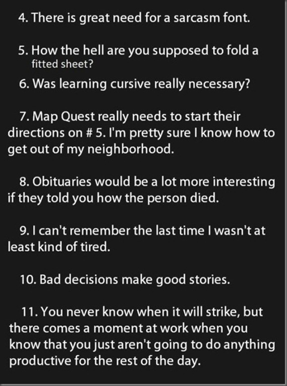
2

4. Oh. Is there? Do we need a sarcasm font? Do we really? Is it not enough to just assume everything on the internet is sarcastic? Or to actually use your mind-grapes once in a while to see through the obvious and determine whether or not something is sarcastic? Friends, there is a sarcasm font. It is called “Comic Sans.” Some of you may disagree, but the nature of this font’s reputation makes it the perfect candidate.

5. *sigh* You grab the sewn in corners and treat those as the corners of a rectangular sheet. This problem was solved before you ever pondered the question.

6. No. It was unnecessary when they made you do it twenty to thirty years ago, and it’s equally necessary now. There doesn’t need to be a uniform standard for “quick, sloppy writing.” Even when there is, it doesn’t matter because everybody just writes THOSE letters even quicker and sloppier, and you still can’t read it.

7. You know how MapQuest (you still use MapQuest? Really?) works, but you still give it your address as the starting location instead of your exit on the freeway. MapQuest (Srsly. Welcome to the 21st century. We use Google here) doesn’t need to be fixed. You need to figure out how to use it. How much do you pay the guy who ties your shoes every morning and brushes your teeth for you?

8. I agree. Obituaries aren’t for comforting people. They’re for entertainment. Really, what informative value is there in an obituary? Anybody that needs to know probably knows already that the person has died. And if they don’t, nobody wants to find out by reading the newspaper. Make obituaries more informative.

9. All I can say is: Wow. You’re old. I’m “not tired” all the time. Not so much during the week, but… Oh. Waitaminute. Nevermind.

10. It depends. Nobody wants to hear about the time I put my term paper off until the last minute and failed English. On the other hand, it’s also not a good story that I put off my term paper till the last minute and got an A. But I guess this is really about REALLY bad decisions. Like that time my buddy Pete and I dropped acid while we were on safari in Kenya. THAT adventure gave new meaning to the phrase “commune with the beast.”

11. Yup. happens. Happened to me at school the other day. I spent three hours pasting myself into a picture in Photoshop. Then I had to go to my InDesign lab. I hate InDesign. It is junk. It’s a toy. It’s desktop publishing for soccer moms, and it doesn’t even conform to the same standards as all the other Adobe products. So I started working on my assignment, finished it, started the next one, ejected my thumb drive, shut down InDesign, put all my stuff away, turned off the monitor and just stared at it for an hour and a half.

3

12. Yes. Do that. I’ll just have one more person to laugh at and call a troglodyte. If you’re okay with technology just stopping so you can save a little money every ten years, you can stop wasting the oxygen you’re stealing from the rest of us.

13. Okay… Then click “no” and shut up.

14. Yeah that’s fairly true. With the exception of suits. my suits get washed… twice a year. Even the raincoat I just bought for my Spike Halloween costume is machine-washable.

15. Srsly. So ya know what I do? When my phone rings, I look at who’s calling, decide whether I’m going to answer, then press the appropriate button on my phone. Honestly. Who still misses phone calls accidentally?

16. What kind of narcicist cares who sees them, as long as somebody does? Vanity knows no “important people.” I walk out of my house looking great every day, because I know SOMEBODY will see me. If watching Heroes has taught me anything, it’s thah you never know who will turn out to be “important” later.

17. I used to do that. Once again I say: “Welcome to the 21st century. We have Google.” Anybody I don’t want to talk to has their own separate voicemail message that says something similar to “stop f*&#ing calling me!”

18. I completely agree. That’s racist. Tall people need to see in the cold too.

4

19. I bet more kisses begin with Rohipnol.

20. Yeah. I must concur with my esteemed internet colleague. I guess. On the other hand, I don’t really get nervous driving through anywhere. I wish Google maps had an option for “don’t show me any search results in a ghetto.”

21. Two words: Battlestar Galactica. Two more words: the Last Unicorn.

22. Get a radio flyer.

23. Um. Okay. Nobody likes red lights, and everybody knows this. What are you trying to say here?

24. O. M. G. Sooooooooooooo true. I almost can’t watch TV without a snack or a laptop.

25. I believe it appropriate to say “what?” once before you switch to “get the dick out of your mouth.” If somebody is that hard to understand, they need to be shamed into speaking properly. If they have a physical handicap, you instead say “I’m sorry. I’m having a really hard time understanding you. Could you talk a little slower?” If you’re in a loud place, “smile and nod” is appropriate. On the other hand, why aren’t you wearing earplugs? Then you’d be able to hear the person just fine.


5

26. I’ve never had that happen. My philosophy in any driving situation is “I let one guy in.” If two lanes are merging down to one, I get over two miles in advance when the start putting up signs that say “lane closed: 2 miles.” So all those people who keep zooming down the lane that’s closing: one of you is getting in front of me, then I’m clamping my teeth on his bumper and not letting go until the lane opens up again.

27. That is a fallacy. Pants don’t get dirty the same way shirts do. Shirts get dirty after being worn once. Pants get dirty when they’re dirty. Just to be safe, I change pants every Saturday, whether they’re dirty or not.

28. It’s just you. Do you think three-year-olds get dumber every year too? The thing about high school kids is: they’re the same age every year. they just don’t get any smarter.

29. I actually LOVE that feeling and try to duplicate it after it happens by accident. It never works.

30. I hate bicyclists that don’t know the rules. You’re not a pedestrian: get off the f*&#ing sidewalk. You drive in the road. You signal your turns, and you observe the traffic lights. I don’t move over on the sidewalk for bikes. Well, I do in Springfield, but I hate myself for it.

31. I used to do that. Now I just don’t look at my watch unless I care what time it is. That way I remember.

32. No on all counts. I always have trouble snoozing my alarm clock. And mine doesn’t even have a button. It’s the kind you just tip over to snooze.

So… that was fun for me. Was it good for you too?

Friday, November 19, 2010

First Trip to the Product Studio

So today was my first time in the college’s product studio. That’s the smallest of the three studios, used mainly for product shots. The assignment was to shoot two different pieces of glassware and get both white-line and black-line shots. I had a lot of fun using the Canon EOS Utility to shoot from the computer so I didn’t have to touch the camera for those long exposures (took one at three seconds).

During the demo, when he was showing us all how to shoot glass and offering suggestions as to how to setup the lighting, the professor told us that expensive glassware makes for better photos, and that very expensive crystal would yield the very best results. He said that when he had to shoot glassware at RIT 40 years ago, what he did was went to Macy’s and bought some. He brought it to the studio, took it out of the box, shot it, put it back in the box still in perfect condition, and returned it to the store.

I thought that was a fantastic idea. I’ve done similar things in the past, and planned to do just that. Kerry thought it was a good idea too. She just didn’t want to front the money. So I grabbed a Reidel stemless white wine glass and a Disaronno funny-shaped shot glass out of my liquor cabinet and shot those. I also brought a plain ol’ rocks glass, a rocks glass shaped like the shot glass (which you will see in a moment), and a bulb-shaped, cork-sealed bottle (like you would expect a mana potion to be in) I bought at Michael’s two weeks ago for this express purpose.

I was only scheduled for an hour in the studio, and figured for fifteen minutes to clean up (I didn’t plan to make a mess, but everything had to be put away before I left). And since I wanted to get both white lines and black lines (you’ll see what that means in a minute), I only had time to shoot the two pieces.

Those being the facts, I did show up about fifteen minutes early, and there was no one signed up for the slot before mine. So I got in a little early and had a few minutes to get acquainted with my new friend, the Canon EOS 30D, and his friend, the EF 24-85 mm lens.

I noticed a few differences between this setup and my Rebel. The most infuriating was the viewfinder. I don’t know if it’s the lens or the camera, but when I looked through it, everything was grainy, which made it something of a chore to focus properly. When I have problems focusing my Rebel, I use the autofocus to help me by holding the trigger halfway done and waiting for the red light to light up. That didn’t work here because of the lower lighting conditions I was working with in the studio. The other big difference is the power switch. I do not like the power switch on the D models. They have “off,” “on,” and “-.” I don’t know what “-” is for, but every time I wanted to turn the switch to “on,” I flipped it all the way past “on” to “-.” So that was mildly annoying. Also, the D series have an LCD display on top, whereas the Rebel uses the preview screen to display all the same data. I like that a lot, since it uses a lot less power to run that little LCD than it does to light up the whole preview screen.

First, let me explain the setup. I had two hospital tables (just like the ones they serve your lunch on) at the same height, about three feet apart, with a heavy slab of plate glass laying across them. Behind that was a big drape of white paper. behind the paper was a big triple-bulb light. with a reflector on the back and a diffuser on the front. The line you see in the background of these photos is the back edge of the plate glass. In a couple of them I hadn’t zoomed in quite far enough, so I had to crop out a little bit of the tables.

Glassware-0001shopped

This is the first shot I took, and I think it turned out to be one of the best. The way I have the glass turned, it gives that pleasing curve to the reflection. The later shots either have a straight line across the glass, or the curve is pretty wonky. For this first shot, I had the light pretty far back from the paper barrier, so the lighting is pretty even.

Glassware-0011shopped

For this shot, I moved the light much closer. Maybe four or five inches away from the paper, so there’s a pretty distinct halo. I should have also lowered the light, so that the center of the halo is right on the “horizon,” but this shot still came out pretty well.

Glassware-0017shopped

For this shot, there was a big piece of black construction paper taped to a light stand. So I put it between the white paper backdrop and the subject to get this nice “white” line effect. The blue tint here is the way every single shot turned out today. I have no idea why that is. The room didn’t look blue, there was no filter on either the lens or the light. For most shots, I just fixed the white balance… Shit. That’s what it was. I didn’t check the white balance on the camera before I started shooting. Somebody was probably playing with the white balance, or was shooting under fluorescent lighting, or some other such thing, and just didn’t reset the white balance to auto. Damn. Oh well. Mystery solved. Now I know to check that in the future.

Anywho… For this shot, I left it blue because it gives the nifty impression that the shot glass is carved out of ice.

Glassware-0027

Like I said, I wanted to get white and black line shots of each glass. So here’s my white line (or “dark field”) shot of the wine glass. Clearly visible in this shot are the reflections of every damn thing in the studio.On the left is the computer screen, and on the right… a roll of brown paper towel standing next to a red and white bottle of glass cleaner. I really should have paid closer attention to this early on. I did eventually discover that this was happening, but I had apparently already used up my quota of good shots for the day. This is the only shot that photoshop has never touched. In the other shots, the glassware was dirty, or the plate glass “tabletop” was dusty (the first thing I did once I got the tables setup was wipe down the plate glass), and that had to be fixed (using the spot heal brush and the patch tool). I tried taking the computer screen off the glass in this shot, but it just made the reflections in the right side look more pronounced.

Glassware-1shopped

I started cleaning up, got all my gear packed up (the glassware, my memory card, etc: all MY stuff), then decided to get one last shot. So I plopped my Kindle (gently) down on the glass, turned the camera back on, focused on the leading edge, and snapped it. Just for fun. I might go back and take out the “horizon” line in this one.

So that’s my first venture into the product studio. If I can manage to get in there again before this assignment is due (highly unlikely), I’ll reshoot the dark-field wine glass, but I’ll remember to clear the tables and turn off the monitor when I click the shutter. Next week, it’ll be portraits in the mixed-use studio. I probably won’t get those up here until after Thanksgiving. But I might. We’ll see. Seacrest out.