Quotables

But what do I know? I'm just a twice clicken brown shirt teabaggin tjroll. Right? --PatP

Not now. There are dirty, swaying men at my door. They’re looking for Brian. I need to go deal with that. --Thor

If Joss Wedon was near me, I'd of kicked his ass. --PaulC

Sunday, October 31, 2010

Tea Nazi Rant.

Coat of Arms of the NSDAP and "Deutsches ...

Image via Wikipedia

This is a rant. It is a rant about republicans and religion in general. It’s pretty heavy at the end. If you’re not in the mood to be depressed and/or pissed off, don’t read it. You have been warned.

Saying you believe in separation of church and state doesn’t make it okay to try and get the government involved in religion. Either the government can legislate religious issues or it can’t. Marriage is an institution of religion. If you think the government should be allowed to say anything about it, you don’t believe in separation of church and state. The end.

It’s okay to not want church and state to be separate. They’ve got religious government all over the middle east. Just look how happy everyone is. There’s no drinking, no gambling, no singing in public, no women without hats, no pornography and (best of all) NO FAGS!! Sounds like paradise to me. Christianity was a driving political force throughout the middle ages. Science was illegal and everybody was just so damn happy.That’s why there were so many crusades. People were just so happy and so excited to share the love of Christ that they went to the middle east and killed people (people who worshipped they same God they did) for worshipping a different God than they did.

The structure of the American government is based around the idea that religion and government in the same building is a bad idea. Don’t you dare say America was founded on Christian morals, or I’ll put you in jail for coveting your neighbor’s ass (the Old Testament will stop counting when you take it out of the “holy book.” But that’s a whole other topic).

But this is all ancillary to the big picture. The religious, conservative republican party is the same beast that every Christian political force before it has been: rich people trying to get richer by saying the right things to maintain their power base. That’s what religion is. Religion isn’t about God, and it’s not about salvation. Those are just the tools it most often uses to keep people under its thumb. It’s about money and it’s about power. I think no one understood the power of religion better than L. Ron Hubbard, who said: “I don’t want to make money writing science fiction. If I wanted to make money, I’d start a religion.”

One person doesn’t have a religion. One person has faith, and there’s nothing evil or insidious about that. There’s nothing wrong with believing in Jesus or Mohammed or Buddha (etc.), or even Xenu. Religion is a corporate stupidity. Religion is saying “I believe what you tell me because you’re smarter than me. Anybody who disagrees with you is wrong because I believe what you tell me.”

Here’s what I’m talking about: There are actual Christians out there who honestly believe that the Bible doesn’t contradict itself. You cannot have read very much of the Bible and still believe that. In one bit, God says “don’t kill anybody.” In another bit not too far away from that, God says “go over there and kill everybody. Yes, even the women and children.” He even sends an angel (or at least, a guy from out of town. And I’m not being glib: it’s genuinely unclear) to lead the charge. That’s just my favorite example. There are others as well.

“But the Bible is the word of God, so it can’t possibly contradict itself. You’re taking it out of context.” I thought that’s what the Bible was for: taking bits out of context and making them say whatever is convenient to make your point. That’s what every guy I’ve ever seen quote it on TV does. That’s why there’s so much of it: to discourage the common people from reading it so the priests can tell them what it says and what it means. For a while that didn’t happen as much as in the good ol’ days, but now we’ve come full circle.

That’s what the Nazi party was in the 1930’s, and that’s what the tea nazi party is today: religion. That’s why religious political movements are always (ALWAYS!) anti-education. The German nazis burned books, and so do the American ones. Because anyone who has a mind inquisitive enough to seek education knows they’re full of shit and sees that they’re just saying whatever they have to say to get and keep power. Just like Hitler. Hitler didn’t hate Jews. He didn’t hate anybody. He just needed an object to put the hate on, and Jews were convenient. They were everywhere, so anywhere he needed to go he could get people hating them. Just like the tea party (and the rest of American Christendom) is doing with anyone who doesn’t have a traditional sexual orientation (even those who’s physiology prohibits it).

And before someone calls me on it: I know there are Christians in America who aren’t total assholes. For every Christian I know who is a complete waste of genetic material, I know at least one who is worth their salt. But as long as you call yourself a Christian, you choose to allow bigots and hate-mongers to be your public voice. I base my judgements on what I see and hear. That’s all I can do. So you have to be just as loud as they are when you say “he doesn’t speak for me,” or nobody hears it, which is why people hate you for being a Christian, and why I had to stop doing it.

And it’s going to work. They’re going to win. The tea nazis are going to gain power, they are going to become a major force in the government, and the next world war is going to be everbody against us. But this time, it won’t be a nation trying to conquer its neighbors. It will be a new crusade (because we didn’t learn anything from the old ones) to conquer the world in the name of Jesus. It’ll be just like Command & Conquer. We’ll be Nod. I’ll put money on the fact that we’ll even wear red (you can’t be a Christian army and not wear some red. It’s the rules).

Why will this happen? Because half of us are too stupid to know any better and the other half don’t care enough to do anything about it. Just like nobody in Germany cared enough to stop Hitler before he rose to power, even though they knew it was likely togo wrong. They were all too excited about a re-ignited German nation to care about how they got there.

And just like the allied forces did to the citizens in the towns with concentration camps in them, whoever finally beats us is going to make us walk through the re-education centers where we sent all the atheists and all the gays. They’re going to line us up in front of the ditches where the bodies of all the people who were tortured to death or killed themselves because they couldn’t handle the torture any more are rotting because there are so many they can’t be buried or incinerated fast enough. They’re going to point their guns at us and make us look at all the death. And they’re going to say “you did this. This is your fault. You are as responsible for all of this as the men at the top because you let them do it.” All the stupids will have joined the army, so the only ones left to be marched through the camps will be those of us who know that it really is all our fault.

Am I really the only person who sees this? Am I crazy? Someone please convince me that I’m completely out of my mind and that history doesn’t really repeat itself like every history teacher who ever lived says it does. Someone show me how the tea party is different from the nazi party. Maybe all the news coverage just makes it feel like it’s a greater problem than it really is. And if I’m not wrong, what’s a guy to do? I don’t want this to happen. What can I do to make it not? Vote? Right. Because my vote counts. Run for office? Right. Because I could get the support of a major party or am independently wealthy enough to run my own political campaign. Pray? Oh, I do. And, as previously noted, my vote counts. So this is what keeps me up at night. How about you?

Enhanced by Zemanta

Monday, October 18, 2010

Batmen and Stormtroopers and Ghostbusters! Oh my!

Pardon my poor blogging habits, but this post will be re-posted in the next day or two with links throughout. I would ordinarily just not post until I’m ready, but I really want to get these photos up and it’s bed time. On that note, none of my captions will line up with my photos because Windows Live Writer is for some reason not as good as it used to be. That will also get fixed. I just really want you all to see my convention photos, but it’s well past my bedtime and I just can’t deal with it right now.

New England Comic Con 2010. Was. Awesome. Excuse my poor grammar, but that’s how much fun it was. At first, when we were first planning to go, I thought it would be really fun. Then we got there Friday afternoon, everybody wasn’t there yet and people were just setting up their booths, so I was prepared for some major league boredom. So we went out with PaulC and Jill and had some Seafood. Saturday was awesome.

It was a ton of fun to see all the costumes, chat with a few comic artists and meet some of the Scooby gang. So, with no further ado, here are some photos.

Okay, I lied. Here is some ado. Several people asked me to send them the photos I took of them, so I just started handing out business cards to bring people here to my blog. If you (or something you made/own) are in one of these photos, have it. It’s all yours.

Because there are so many photos on this page (42, if I didn’t mis-count), these are jpegs and not my preferred Tiffs. They are not the best quality, and I put a watermark on them. If you want the Tiffs, I would be more than happy to send them to you. The high-quality images that I send you will not have a watermark, you can do whatever you want with them, and I don’t even want any money. I can’t e-mail them because they’re large files (50-60 Mb per photo), but shoot me an e-mail and we’ll work something out. I’m willing to mail a CD, or maybe setup a download space somewhere. Suffice it to say, we can work something out.

So here’s the show. And I talk during it.

Let me preface with this: all these photos look a lot greyer in my Windows Live Writer window than they do in my image viewer window.

IMG_5500

First, I find it fitting that we begin with some Batmobile. This first one I took as soon as we walked in on Friday. Yes, I asked the guy. And yes, it was okay to take photos of the car. It was getting a photo IN the car that cost money. That would have been cool, but I wasn’t wearing my tights. The rest were taken at various times during the convention when I happened to see the car from a new angle.IMG_5502

I think this is the best one. I think they all came out okay, but some were not well-focused, and others had to be cropped down too far to be very good.

IMG_5607


I didn’t notice at first that the car had the fight sounds around it. So i had to take one more shot to get them in there.


IMG_5501


And of course there was the BatCycle. this is the only decent shot i got of it.


IMG_5617


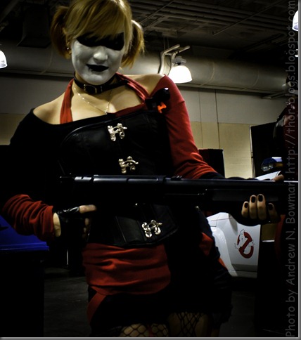
Ladies and gentleman, allow me to introduce the one, the only (sort of) Harley Quinn. There were a few HQ’s floating about the big room, and this was the first Blasty McClownface to pose for me.


IMG_5621

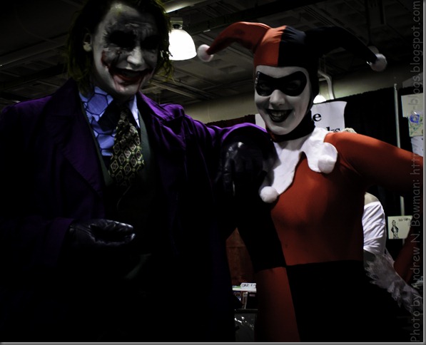
Speaking of circus freaks: where would the queen of scream be without her clown prince? Despite their perverse personas, these two were actually super friendly. Harley shook my hand for like an hour, jumping up and down the whole time, her hat bouncing all over the place.
 

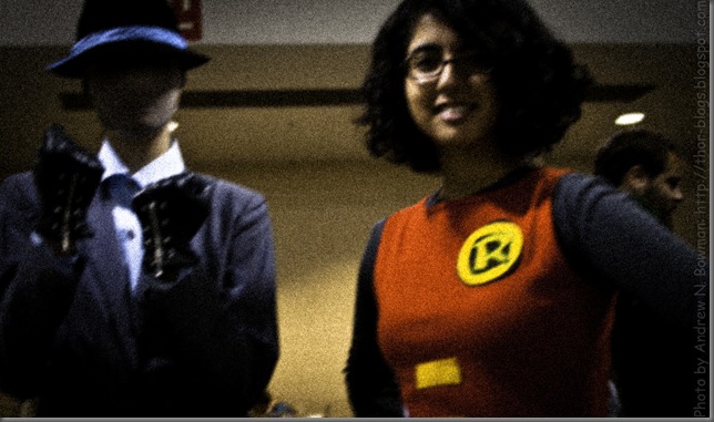
IMG_5633Apologies to Mr. Ward, but this girl was the best-looking Robin at the con. I wish I’d gotten a better angle on this shot. If you can’t tell, she’s putting handcuffs on the Prize Prankster.

IMG_5638I think this is my favorite photo of the con. I saw the caped crusader, Harley and the J Man talking to the commissioner. The shot was too good to pass up, but they seemed to be having an important conversation regarding the quality of the quiltery at Arkham Asylum. So I took the shot. The jester (jestress?) saw me right before I snapped it and politely told me to buzz off.

IMG_5643

The Dynamic Duo in all their colorful tight-wearing glory. I couldn’t have asked for a better pose for the caped crusader and boy wonder (no, not Captain Sunshine and Boy Wonder: Batman and Robin).

IMG_5645 I’m ashamed to admit that I don’t know who this is. Yes. I know. It’s robin. But who’s that WITH Robin? At first I thought it was Rorschach, but now I’ve decided that doesn’t make any sense. Can anybody shed some light?

Right after I took this shot, I walked up to the two (actual) Boston policemen standing guard by the door behind them. I childishly asked if I could take their picture. In hindsight I should have said something like “I realize you guys aren’t in costume and that’s you’re real-life uniform. Would it be alright if I took a photo of the two of you just doing your job?” Instead I said the same thing I had been saying to everybody all day: “hey guys. Can I get a photo of the two of you?” But they were very cool and not dicks at all like they had every right to be and just said “no, we don’t do photos.” So, props to those two gentlemen for being exceptionally cool when I totally (unwittingly) disrespected them and their uniform.

IMG_5646 Two words: Hot. Batgirl and Harley, just bein’ awesome. These two get the prize (in my opinion) for hottest costumes that I got photos of. I must point out that Supergirl was super hot. I did not get her photo because I was both dumbstruck and partially blinded by her awesomeness. Ask Kerry. She was blinded too. She was talking when we were walking out of the con and SG came strutting in, gold cape and hair flowing. Kerry stopped talking. I expected her to stop walking too, but I was able to pull her away from the shiny.

IMG_5618


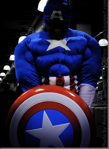
Cap was one of the few non-Batman comic book heroes in attendance at the con. He struck this pose all by himself. I’m sure this wasn’t his first rodeo.


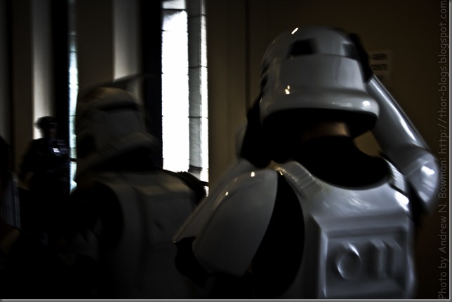
IMG_5523This was our first glimpse of the men (and women, but these were men) of the 501st. As they were marching by, I told Kerry to shout “remember Alderaan!” but she was too afraid.

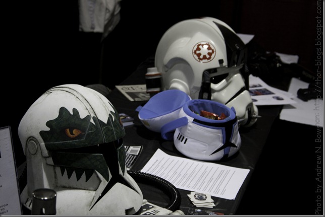
IMG_5613 Speaking of the 501st, I can only assume that these are the helmets of their fallen warriors. There was another group there called the “Mandalorian Mercenaries.” I don’t know if the two are affiliated (I presume that they are), so if I mistake one for the other, you must forgive me. I thought all of these helmets were really cool in their own right, and even cooler if you imagine the warriors who would wear them.

IMG_5610


A welcome blast from the past was this super Sith Lord. I took a photo of him, then he saw me, then he struck this great pose. This was before I started asking people for pictures and was trying to snap surreptitiously. I’m glad I figured out quickly not to do that.


IMG_5614This accommodating member of the Grand Army of the Republic was the first person I asked to pose for a photo. He seemed more than happy to point his weapon at me, just in case I turned out to be a rogue Jedi mid-shoot. This trooper’s armor looks a lot purpler in my windows Live Writer than it does in my Windows Image Viewer. I hope it looks bluer to you than it does to me.

IMG_5630 This suspicious-minded Mandalorian should pay more attention to his surroundings. He’s got the photographer pretty well covered, but the Jedi behind him looks about to start some shit.

IMG_5631


Told ya. Great pose, but I wish I’d caught it from a slightly better angle. I love the way both this Jedi and Darth Maul’s lightsabers cast a cool light on their faces.


IMG_5635


Okay. I’m not complaining. Really, i’m not. but this is the third guy in a helmet to point his gun at me. It’s a very effective pose, but it seems to be the only one of which masked Mandalorians are capable. So I asked this particular meter and three quarters of awesome to give me a second look.


IMG_5636


Which he was only too happy to do. Truth be told, that first pose was better. Props to you, dark grey Mandalorian.


IMG_5637


I saw Emperor Palpatine and his best-dressed apprentice walking around ominously on Friday night. Apparently that Jedi showed up and dispatched them while this poor guy was still getting his boots on. Similar to the blue clone trooper, the color of this guard’s garb is a little off here. In my preview window, it looks a lot redder, whereas here it looks a lot browner. Again, i hope you are seeing him wearing bright red-orange and not dingy maroon-brown.


IMG_5639


The 501st had a booth setup at which they were giving the younger crowd some target practice. This brave trooper was one of the targets.


IMG_5640Some more super cool helmets. The one on the right is an empire-era pilot or driver helmet, and if I remember my history, the closer one is a clone pilot helmet. That would be before they switched to the open-faced, yellow-goggled variety.

IMG_5650


This fine gentleman showed up on Saturday. Coincidentally, immediately following his arrival, all of the card games out in the hall started getting very one-sided. It should be mentioned that no one lost any limbs (at least, not that I was aware of).


IMG_5700

The biggest celebrity of the con didn’t show arrive until Sunday. It was worth the wait. Has anybody seen “Beneath the Dome?” In that documentary, he was portrayed as something of a jerk. That’s pretty accurate. He was super arrogant, all rolling around twittering and being all “hey losers! I’m R2-Frickin’-D2!” It got a little annoying.

But seriously, the guy at the controls was super cool and R2 played with the kiddies.


IMG_5622

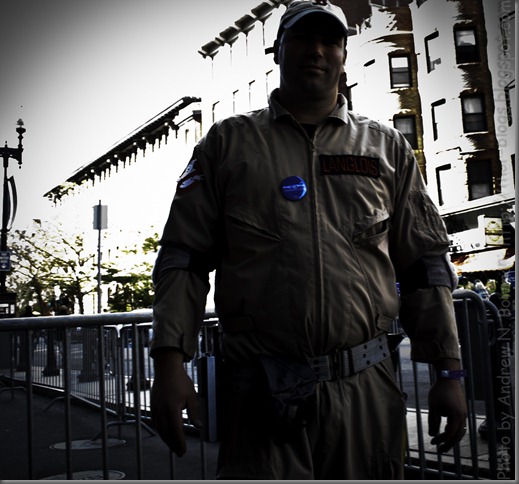
The Ghostbusters of New Hampshire were also at the convention. They’re swell guys. They were taking donations for Make-A-Wish if I remember right. I caught this dude outside as we were leaving for lunch on Saturday. I was really worried I wouldn’t be able to salvage this photo. I didn’t reset my shutterspeed from when I was shooting inside. So this was shot at f/8 and 1/20 at around 1:30 in the afternoon. If you know what I’m talking about, you know that this entire photo was completely washed out.


IMG_5626


No, this ghostbuster is not selling Fords, and neither am I. It just would have been hard to crop that banner out of the shot. So, you’re welcome New Ford Fiesta. I kinda wish this guy had given me a pose, but it’s still not a bad shot. Ghostbusters aren’t exactly common.


IMG_5632

So I saw five ghostbusters standing by their car (which was super awesome, by the way. I think it was a PT Cruiser). Of course I asked them for a group photo. They did this cool pose. I don’t know if this was planned or spontaneous, but it made for a super shot. At first I thought they were flipping me off, and I thought “umm… there are kids around fellas, but whatever you want.” Then I realized they were just pointing and I laughed at myself.

IMG_5634

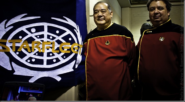
These two officers were very friendly and wanted very badly to recruit me into their fleet of the stars. I was trying too hard to play along for any real conversation to happen. Live and learn.

So that’s all my convention photos. I have more photos that I took in the couple of blocks of Boston between the convention center and the hotel. Those will be up… later. I’m busy with school this week, but I wanted to get this con stuff up quick. I might not get to my wrapup and the outside photos until this weekend. We’ll see.

Once again, if anybody wants hi-quality copies of any of these photos, just let me know and we will work something out. Whatever is worked out, I will not ask anyone for money.

Enhanced by Zemanta

Saturday, October 9, 2010

Assignment 1: Self Portrait

  So my first photography assignment was a self-portrait. I took 58 images and handed in six. I should have handed in seven. Here they are. Photoshop never touched these images. I took them all with my Canon Digital Rebel XTi and my dad’s tripod. For (mild) editing, I used Adobe Lightroom (really cool application. Check it out if you do photography).

The first thing I did with all of these photos was to set the color to 5500 Kelvin. It was off by a little bit in each one, and setting them all to daylight just made the colors look a little more real. I only cropped one after the fact, and I’ll tell you why when I get there. If you don’t care about photographic processes or what I did to edit the raw image, skip the reading. But come back for the last paragraph.

If you can’t see the images, fix your browser. Seriously, these are all tiffs. You should be able to see them in your browser. That doesn’t mean you necessarily can. If you can’t, try this. If that doesn’t work, e-mail customer service and tell them you want your browser to support the Tiff file extension. Seriously. It’s a little bit ridiculous that your browser doesn’t support Tiffs. Having said that, my understanding is that most browsers can’t display Tiffs without a plugin.

I won’t convert them to jpegs, so don’t ask. Jpeg compression supports a little over 16 million colors (8 bits per channel). Tiff supports a little more than 281 TRILLION colors (16 bits per channel). I did too much work to lose all that color data. That does mean 58mb photos, but that’s the price of 16 bits per channel. I would just put up the cr2’s, but I’m pretty certain nobody’s web browser supports raws. That being said, if someone WANTS the raws, I do still have the originals, but I saved my developed raws as Tiffs, so I don’t have raws of the finished products.

If more than one person can’t figure out how to see Tiffs in their web browser, I’ll try to figure something out. So don’t hesitate to speak up, but if you’re the only one, you will probably be ignored.

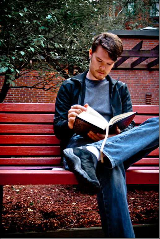
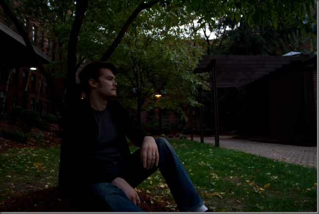
BenchPortraitOriginal BenchPortrait


Original photo on right.

For this photo, after I filled in some light, I darkened the blacks a little bit to put some contrast into my jacket, which is all black, even though it looks like there’s some blue in it in these shots. I fixed the lights and darks, the highlights and the shadows to make the contrast across the whole image a little more. I desaturated the blues to make my jacket look black and my shirt look grey (which is what they really are). I know the jacket looks a little blue still, but I couldn’t lower the saturation any further without totally washing out the color in my jeans (I thought about just letting my jeans be grey, but this is a graded assignment and I didn’t want to look childish for having a whole bunch of sliders all the way to one side. More than that, they’re not grey. So they’re still blue). Next I desaturated the greens and yellows to mute the colors in the tree behind me and make you look where I want you to look. If you look too closely, the leaves do look a little funny. Then some noise reduction and a black vignette and done. I think this is the only photo where I’m on the right side of the frame (which is arguably where I should be).

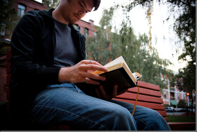
BookPortraitOriginal  

Original photo directly above.


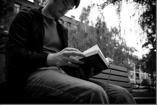
BookPortrait

I was going to crop this one to get rid of the parking lot, but it’s a good thing I didn’t. Apparently it needs that dark foliage on the right side to anchor it. I guess there’s this thing: because our culture reads left to right, we need an anchor on the right side of a photo to keep our eye in it. Personally, I never see what people are talking about with rules like that. My eye stays where I want it to go. I always see a different focal point in an image than everybody else, and my eye doesn’t “slide off the page.” But rules are there for a reason, and there’s no point breaking them if you don’t know why they’re there in the first place (in art). This is one of only a couple of shots that I took at an upward angle. Turns out, that’s a good idea. It makes your subject look more important. “Larger than life” is I think the appropriate description.

I edited this image in color first, then converted it to greyscale. In hindsight, I wish I’d made the decision initially to go grey. It would have saved me a lot of work. I had to fill a lot more light in this one. That’s not necessarily a big deal, except that it keeps making my jacket and t-shirt look blue. I totally blew out the BookPortraitGreylights and highlights to completely wipe out the sky. To compensate, I had to darken the shadows to show some contrast. I then lightened the darks a bit to make my book a little more visible.

I heavily desaturated the reds, greens and yellows, to take focus away from the trees and the brick building behind me. This also of course desaturated the bench, which I wanted to keep highlighted, but you can’t have everything. I don’t like to play with the secondary colors, but in this case I completely desaturated the aqua “channel” to wash-out the bright green awnings in the parking lot to the right. To finish up, I desaturated the blues again, dumped in a ton of noise reduction, and added the dark vignette. At Kerry’s suggestion, I popped this one to greyscale after I had already fixed it up. I think it works better that way, and so did Professor Ruderman. Score.


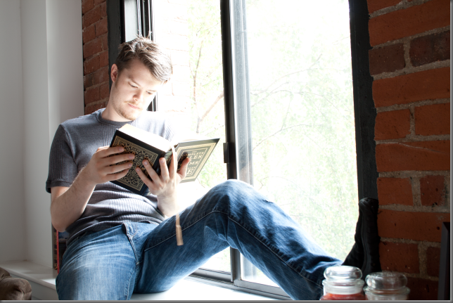
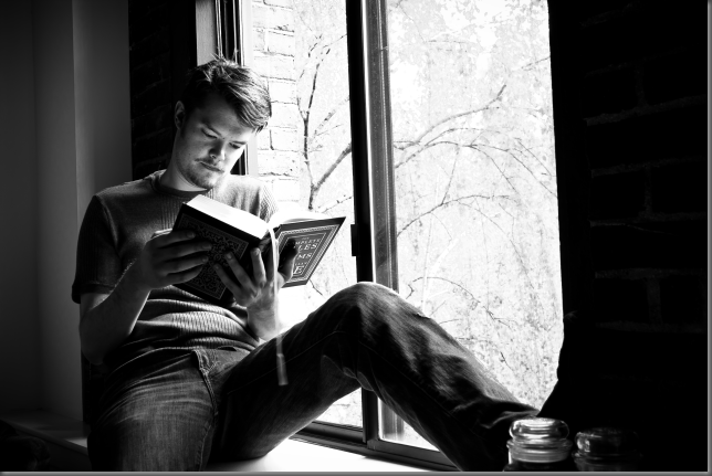
ReadingPortraitOriginal

I actually was pretty happy with the way this image came out of the camera. But I think you’ll agree: my final product looks better. I didn’t hand this one in with the assignment because it didn’t occur to me to put it in greyscale until later that day. I think it’s better than the other one of me in the window. Hence, Lesson 2: always try grey. Any given photo might look better in greyscale, and you just don’t know until you see it. For this shot, I actually had to set the tripod on the bed. So it was a little tricky to line things up just right without leaning on the bed. Even clicking the shutter button I had to be careful not to put any downward force on the tripod or it would screw up my focus.


ReadingPortrait I think this particular image has the heaviest vignette of any of the ones in this article. Just because it was so bright out, and I had to play with the light so much (in LightRoom, not “on set”), I needed to make the room dark again without darkening outside the window too much. I did have to play with the light a lot more delicately, just because I wanted to keep that window super bright. I didn’t NEED to play with the colors quite so much in this one, since there was plenty of light in the original shot. I actually added overall color saturation. After darkening the room a bit, it became very apparent that the wall behind me is in fact not quite pure white. So I cranked the yellow saturation down to almost nothing. That also made the gold coloring on my book look lighter and more golden. I also took out almost all of the green so as to keep your eye away from the trees outside, which all looked especially brilliant green all day. While this particular shot never made my t-shirt look blue, it did make my pants look especially vibrant, so I pulled down the blue saturation as well. To finish up, I did the usual noise reduction and added a heavier vignette than usual (I don’t think it’s overpowering).ReadingPortraitGrey

This time, instead of just clicking the greyscale button, I reset the image back to raw and started all over. I think it looks just as good as the outdoor grey, and I  was able to drop about half of the heavy vignette that the color image needed. At least, that’s what it looks like. After double-checking my numbers (LightRoom is so awesome), it turns out the vignette here is actually about ten percent heavier. It’s just less dramatic because there’s no color.


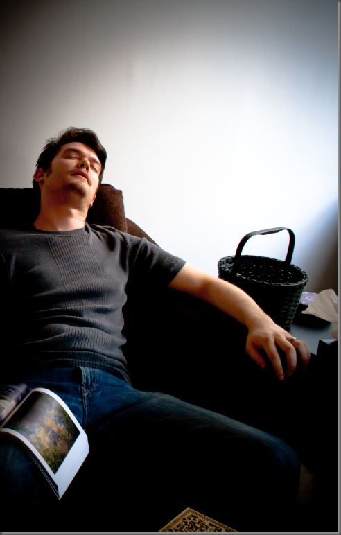
SleepPortraitOriginal


This is the one I cropped. It looks okay now, and it looks fine after I’ve played with it. I’m happy with the crop. I think it makes the shot work much better. If I wasn’t happy with the crop, really what I should have done is re-shoot. The backpack and the couch cushion, which I put in on purpose (damn my eyes!), were just full of noise when I filled in some light and played with the levels. No amount of noise reduction could make them look okay. And in fact, the couch itself picked up a good amount of noise, but by being anal about the light levels, and careful with my noise reduction, I made it (mostly) go away. I shot this one downward… because. I was experimenting with different things all day, and it  was time to crank the tripod up as high as it would go. For this shot, I think it worked.


SleepPortrait

If you zoom in on the lightened corner of the couch, you might still be able to see some of the noise I was talking about. If you zoom in on the right side of my face (my right, not your right), you will definitely see some color noise.

Again, photo way too dark. Available light was just not my friend today (on the other hand, I learned how to light without flash and how to correct for available light). Not only did I have to raise the exposure in LightRoom, I also lit up the shadows, the darks and the highlights.

I didn’t touch the colors here, and I wish I had. I should have brought down the saturation on the blue channel just a bit. My pants really do look too vibrant, and the shadows in my shirt look a little blue.

Yes, that’s a different book sitting open than the book I’ve been reading all day. That’s my photography text book. Sitting on the table in front of me is the complete works of Edgar Allen Poe, which is the book in all the other shots.


SwordPortraitOriginal


This one was a bitch. I took six or seven shots with the sword, and this was the only one that didn’t look like I was displaying the sword. I knew right after I took it that this one was out of focus and I really wish I had re-shot it. Lesson 1 (or rule 2): If it looks out of focus on the camera’s little two-inch led screen, it’s WAY out of focus. re-shoot it. I really had to beat the piss out of this image to make it presentable. As an art project, I’m fairly satisfied with the results. As a graded assignment, I wrote my professor an e-mail and told him I didn’t mean to hand this one in.


SwordPortrait


Here’s how it came out. I sharpened it to within an inch of its bits. That helped, but it still looked like crap. I dumped in all the luminance and color noise reduction LightRoom could muster. That helped a little more, but it still looked really bad. Finally, I did something I never do. I added film grain effect. Kill me. Kill me now, Kill me quick. Film grain looks bad. There is no reason to ever ADD film grain to a photo. Grain is what makes old photos harder to work with. I will never understand why this “feature” exists anywhere, particularly in a professional digital image manipulation application. Why would you ever intentionally make an image look inarguably worse? The film grain didn’t make the image look better. Don’t you dare say it did. What it DID do is make it appear as though I made the image look like shit on purpose. Will I hang this one on the wall in my office? Yeah probably. This one is getting printed at 300 dpi and put in an expensive-looking frame. It’s going to follow me around for my entire career as a professional photographer as a reminder of lesson number one: RE-SHOOT!

TreePortraitOriginal


I was lucky this shot turned out well. I only took it once, and I didn’t expect to use it. I just thought I better get a shot at the tree without the sword. I also took one with the book before this one. This was my last shot of the day.


TreePortrait


I wasn’t going to use this one, but I wanted to put in one more shot, it was too late to go back outside and get one and all of the shots at of me at my computer sucked (and too bad. some of them were okay).

I really didn’t have to do very much to this one. The two issues that came up in just about every photo I handed in were the trees and the blues. In this one as well, I dumped the saturation on the greens and yellows, and dropped it a bit on the blues. I did put in a little vignette, just to keep MY eye from wandering out of the image. YOUR eye might be held in by the shed to the right. My eye is not so easy fooled.

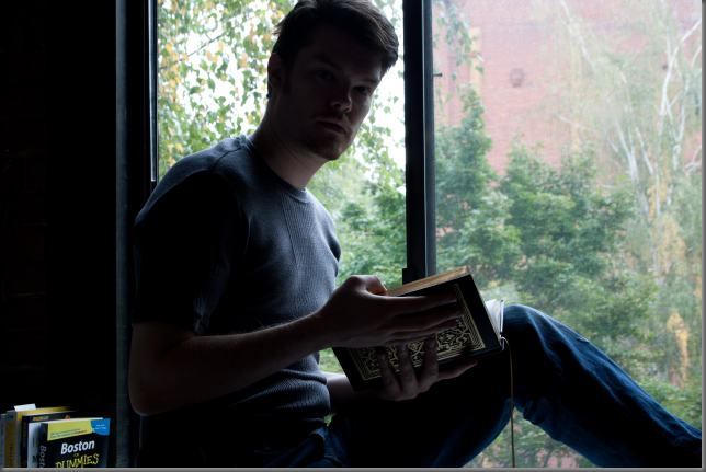
WindowPortraitOriginal


This was my third shot of the day. It needed a TON of light adjustment. Shooting directly out a window is a bad idea. It looks okay on the subject (if you’re not square with that as well), but it totally erases all the shadows and highlights everywhere else. There’s just light and dark. Anyway. It took me a few shots to get my hands in just the right position (notice I hadn’t put all my rings on yet). I kept taking a shot, then looking at it in the camera preview screen, then holding the book and trying to twist my head around to see my hands. Vain, I know. But that’s just the kind of narcissist I am.


WindowPortrait


So here’s the finished product. This is the first one I edited, and I think it came out alright. I wish I had killed the trees a little more, and I wish I had washed out the blues a little more also. I basically just fixed the light, raised the overall saturation, then made the reds just a ting bit yellow because it looked like I was wearing red lipstick.


So the problems I had in just about every photo were: vivid vegetation drawing attention from magical me, jeans, t-shirt and jacket too blue, and noise reduction basically sanding down the ribbing on my t-shirt. That was an interesting dilemma. I chose that particular shirt because it has some interesting texture to it and because it’s pretty close to a middle grey. So obviously, I wanted to keep the texture visible.

Noise reduction reduces the amount of colored “snow” in the image by averaging every pixel with the pixels adjacent to it. Unfortunately, that also makes the texture of my shirt disappear, leaving just a slightly (almost imperceptibly, in some cases) darker stripe right down the middle. So in every shot, I had to balance three things: the need for light, the need for noise reduction, and the desire for my nice, textured t-shirt to be accurately represented. Any rational human would probably say “damn the torpedoes!” and just use too much noise reduction.

But that would be too much. So, in trying to keep the texture of the shirt, I was able to judge just how much noise reduction was too much.

The jacket vs. pants quandary was a constant battle. Part of me said “fuck it. Let there be a blue shadow on the jacket.” The same part of me said “fuck it. Let the pants be grey.” The (thankfully) sane, third part of me (whom I have named Dan Forsythe) said “compromise.” So the jacket has just a hint of blue shadow to it, and the jeans look a little washed out (which they actually are). Next time, I’ll remember this and dress accordingly. I’m not sure what that means. I’ve learned my lesson, I’m just not able to apply it yet.

The trees were an easy fix: dump the saturation on green and yellow. It’s just lucky I wasn’t wearing anything green or yellow.

So that’s all the photog tech talk. The rest of you can start reading again. Really all I wanted to say is: if any of you (gramma, mom, etc.) want copies of any of these, I can make that happen. Let me know.

Enhanced by Zemanta