So my first photography assignment was a self-portrait. I took 58 images and handed in six. I should have handed in seven. Here they are. Photoshop never touched these images. I took them all with my Canon Digital Rebel XTi and my dad’s tripod. For (mild) editing, I used Adobe Lightroom (really cool application. Check it out if you do photography).
The first thing I did with all of these photos was to set the color to 5500 Kelvin. It was off by a little bit in each one, and setting them all to daylight just made the colors look a little more real. I only cropped one after the fact, and I’ll tell you why when I get there. If you don’t care about photographic processes or what I did to edit the raw image, skip the reading. But come back for the last paragraph.
If you can’t see the images, fix your browser. Seriously, these are all tiffs. You should be able to see them in your browser. That doesn’t mean you necessarily can. If you can’t, try this. If that doesn’t work, e-mail customer service and tell them you want your browser to support the Tiff file extension. Seriously. It’s a little bit ridiculous that your browser doesn’t support Tiffs. Having said that, my understanding is that most browsers can’t display Tiffs without a plugin.
I won’t convert them to jpegs, so don’t ask. Jpeg compression supports a little over 16 million colors (8 bits per channel). Tiff supports a little more than 281 TRILLION colors (16 bits per channel). I did too much work to lose all that color data. That does mean 58mb photos, but that’s the price of 16 bits per channel. I would just put up the cr2’s, but I’m pretty certain nobody’s web browser supports raws. That being said, if someone WANTS the raws, I do still have the originals, but I saved my developed raws as Tiffs, so I don’t have raws of the finished products.
If more than one person can’t figure out how to see Tiffs in their web browser, I’ll try to figure something out. So don’t hesitate to speak up, but if you’re the only one, you will probably be ignored.
Original photo on right.
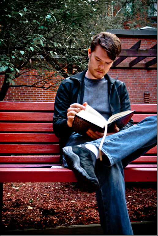
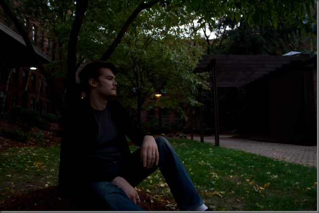
For this photo, after I filled in some light, I darkened the blacks a little bit to put some contrast into my jacket, which is all black, even though it looks like there’s some blue in it in these shots. I fixed the lights and darks, the highlights and the shadows to make the contrast across the whole image a little more. I desaturated the blues to make my jacket look black and my shirt look grey (which is what they really are). I know the jacket looks a little blue still, but I couldn’t lower the saturation any further without totally washing out the color in my jeans (I thought about just letting my jeans be grey, but this is a graded assignment and I didn’t want to look childish for having a whole bunch of sliders all the way to one side. More than that, they’re not grey. So they’re still blue). Next I desaturated the greens and yellows to mute the colors in the tree behind me and make you look where I want you to look. If you look too closely, the leaves do look a little funny. Then some noise reduction and a black vignette and done. I think this is the only photo where I’m on the right side of the frame (which is arguably where I should be).
Original photo directly above.
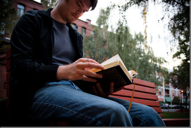
I was going to crop this one to get rid of the parking lot, but it’s a good thing I didn’t. Apparently it needs that dark foliage on the right side to anchor it. I guess there’s this thing: because our culture reads left to right, we need an anchor on the right side of a photo to keep our eye in it. Personally, I never see what people are talking about with rules like that. My eye stays where I want it to go. I always see a different focal point in an image than everybody else, and my eye doesn’t “slide off the page.” But rules are there for a reason, and there’s no point breaking them if you don’t know why they’re there in the first place (in art). This is one of only a couple of shots that I took at an upward angle. Turns out, that’s a good idea. It makes your subject look more important. “Larger than life” is I think the appropriate description.
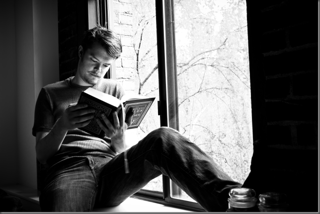
I edited this image in color first, then converted it to greyscale. In hindsight, I wish I’d made the decision initially to go grey. It would have saved me a lot of work. I had to fill a lot more light in this one. That’s not necessarily a big deal, except that it keeps making my jacket and t-shirt look blue. I totally blew out the 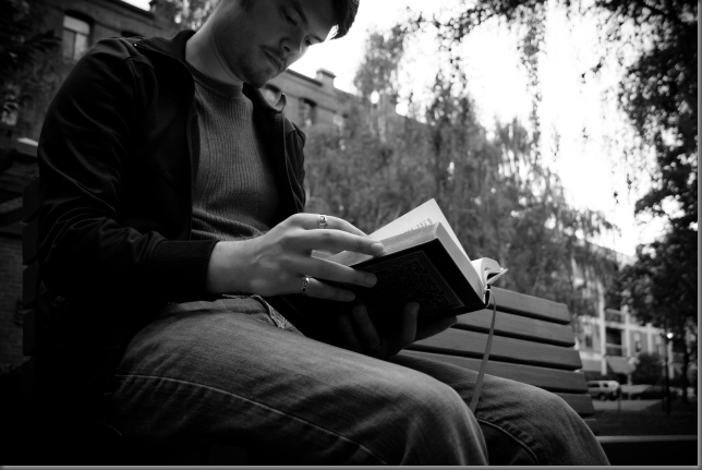
I heavily desaturated the reds, greens and yellows, to take focus away from the trees and the brick building behind me. This also of course desaturated the bench, which I wanted to keep highlighted, but you can’t have everything. I don’t like to play with the secondary colors, but in this case I completely desaturated the aqua “channel” to wash-out the bright green awnings in the parking lot to the right. To finish up, I desaturated the blues again, dumped in a ton of noise reduction, and added the dark vignette. At Kerry’s suggestion, I popped this one to greyscale after I had already fixed it up. I think it works better that way, and so did Professor Ruderman. Score.
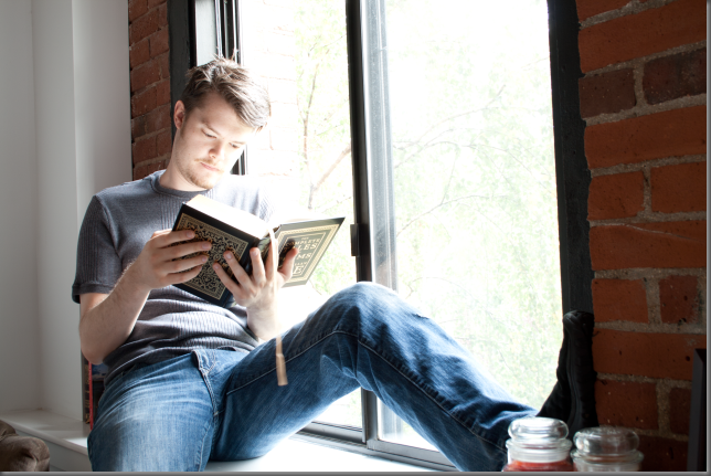
I actually was pretty happy with the way this image came out of the camera. But I think you’ll agree: my final product looks better. I didn’t hand this one in with the assignment because it didn’t occur to me to put it in greyscale until later that day. I think it’s better than the other one of me in the window. Hence, Lesson 2: always try grey. Any given photo might look better in greyscale, and you just don’t know until you see it. For this shot, I actually had to set the tripod on the bed. So it was a little tricky to line things up just right without leaning on the bed. Even clicking the shutter button I had to be careful not to put any downward force on the tripod or it would screw up my focus.

This time, instead of just clicking the greyscale button, I reset the image back to raw and started all over. I think it looks just as good as the outdoor grey, and I was able to drop about half of the heavy vignette that the color image needed. At least, that’s what it looks like. After double-checking my numbers (LightRoom is so awesome), it turns out the vignette here is actually about ten percent heavier. It’s just less dramatic because there’s no color.
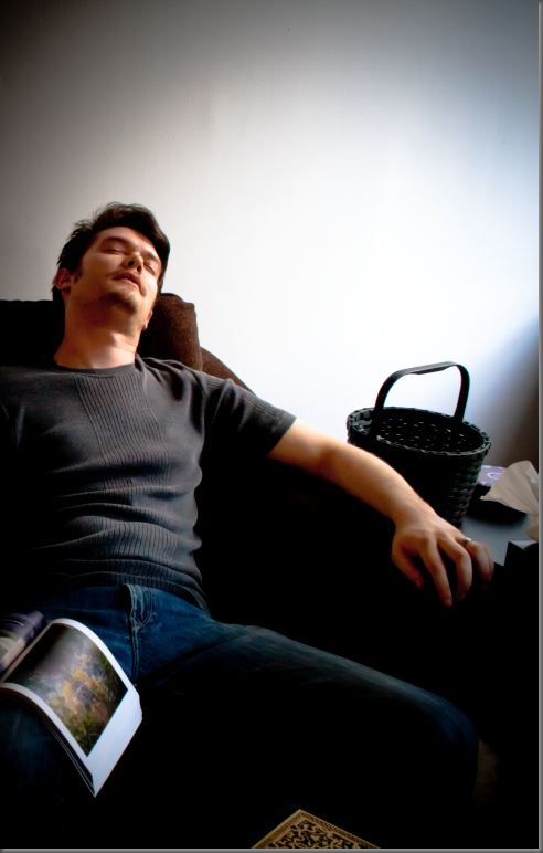
This is the one I cropped. It looks okay now, and it looks fine after I’ve played with it. I’m happy with the crop. I think it makes the shot work much better. If I wasn’t happy with the crop, really what I should have done is re-shoot. The backpack and the couch cushion, which I put in on purpose (damn my eyes!), were just full of noise when I filled in some light and played with the levels. No amount of noise reduction could make them look okay. And in fact, the couch itself picked up a good amount of noise, but by being anal about the light levels, and careful with my noise reduction, I made it (mostly) go away. I shot this one downward… because. I was experimenting with different things all day, and it was time to crank the tripod up as high as it would go. For this shot, I think it worked.
If you zoom in on the lightened corner of the couch, you might still be able to see some of the noise I was talking about. If you zoom in on the right side of my face (my right, not your right), you will definitely see some color noise.
Again, photo way too dark. Available light was just not my friend today (on the other hand, I learned how to light without flash and how to correct for available light). Not only did I have to raise the exposure in LightRoom, I also lit up the shadows, the darks and the highlights.
I didn’t touch the colors here, and I wish I had. I should have brought down the saturation on the blue channel just a bit. My pants really do look too vibrant, and the shadows in my shirt look a little blue.
Yes, that’s a different book sitting open than the book I’ve been reading all day. That’s my photography text book. Sitting on the table in front of me is the complete works of Edgar Allen Poe, which is the book in all the other shots.
This one was a bitch. I took six or seven shots with the sword, and this was the only one that didn’t look like I was displaying the sword. I knew right after I took it that this one was out of focus and I really wish I had re-shot it. Lesson 1 (or rule 2): If it looks out of focus on the camera’s little two-inch led screen, it’s WAY out of focus. re-shoot it. I really had to beat the piss out of this image to make it presentable. As an art project, I’m fairly satisfied with the results. As a graded assignment, I wrote my professor an e-mail and told him I didn’t mean to hand this one in.
Here’s how it came out. I sharpened it to within an inch of its bits. That helped, but it still looked like crap. I dumped in all the luminance and color noise reduction LightRoom could muster. That helped a little more, but it still looked really bad. Finally, I did something I never do. I added film grain effect. Kill me. Kill me now, Kill me quick. Film grain looks bad. There is no reason to ever ADD film grain to a photo. Grain is what makes old photos harder to work with. I will never understand why this “feature” exists anywhere, particularly in a professional digital image manipulation application. Why would you ever intentionally make an image look inarguably worse? The film grain didn’t make the image look better. Don’t you dare say it did. What it DID do is make it appear as though I made the image look like shit on purpose. Will I hang this one on the wall in my office? Yeah probably. This one is getting printed at 300 dpi and put in an expensive-looking frame. It’s going to follow me around for my entire career as a professional photographer as a reminder of lesson number one: RE-SHOOT!
I was lucky this shot turned out well. I only took it once, and I didn’t expect to use it. I just thought I better get a shot at the tree without the sword. I also took one with the book before this one. This was my last shot of the day.
I wasn’t going to use this one, but I wanted to put in one more shot, it was too late to go back outside and get one and all of the shots at of me at my computer sucked (and too bad. some of them were okay).
I really didn’t have to do very much to this one. The two issues that came up in just about every photo I handed in were the trees and the blues. In this one as well, I dumped the saturation on the greens and yellows, and dropped it a bit on the blues. I did put in a little vignette, just to keep MY eye from wandering out of the image. YOUR eye might be held in by the shed to the right. My eye is not so easy fooled.
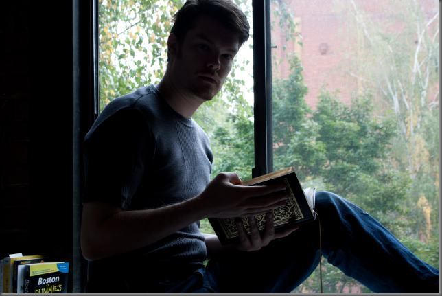
This was my third shot of the day. It needed a TON of light adjustment. Shooting directly out a window is a bad idea. It looks okay on the subject (if you’re not square with that as well), but it totally erases all the shadows and highlights everywhere else. There’s just light and dark. Anyway. It took me a few shots to get my hands in just the right position (notice I hadn’t put all my rings on yet). I kept taking a shot, then looking at it in the camera preview screen, then holding the book and trying to twist my head around to see my hands. Vain, I know. But that’s just the kind of narcissist I am.
So here’s the finished product. This is the first one I edited, and I think it came out alright. I wish I had killed the trees a little more, and I wish I had washed out the blues a little more also. I basically just fixed the light, raised the overall saturation, then made the reds just a ting bit yellow because it looked like I was wearing red lipstick.
So the problems I had in just about every photo were: vivid vegetation drawing attention from magical me, jeans, t-shirt and jacket too blue, and noise reduction basically sanding down the ribbing on my t-shirt. That was an interesting dilemma. I chose that particular shirt because it has some interesting texture to it and because it’s pretty close to a middle grey. So obviously, I wanted to keep the texture visible.
Noise reduction reduces the amount of colored “snow” in the image by averaging every pixel with the pixels adjacent to it. Unfortunately, that also makes the texture of my shirt disappear, leaving just a slightly (almost imperceptibly, in some cases) darker stripe right down the middle. So in every shot, I had to balance three things: the need for light, the need for noise reduction, and the desire for my nice, textured t-shirt to be accurately represented. Any rational human would probably say “damn the torpedoes!” and just use too much noise reduction.
But that would be too much. So, in trying to keep the texture of the shirt, I was able to judge just how much noise reduction was too much.
The jacket vs. pants quandary was a constant battle. Part of me said “fuck it. Let there be a blue shadow on the jacket.” The same part of me said “fuck it. Let the pants be grey.” The (thankfully) sane, third part of me (whom I have named Dan Forsythe) said “compromise.” So the jacket has just a hint of blue shadow to it, and the jeans look a little washed out (which they actually are). Next time, I’ll remember this and dress accordingly. I’m not sure what that means. I’ve learned my lesson, I’m just not able to apply it yet.
The trees were an easy fix: dump the saturation on green and yellow. It’s just lucky I wasn’t wearing anything green or yellow.
So that’s all the photog tech talk. The rest of you can start reading again. Really all I wanted to say is: if any of you (gramma, mom, etc.) want copies of any of these, I can make that happen. Let me know.








I want a *holler * out to Aunt Jen - who gave you the cool sword :)
ReplyDeleteLove the pictures.
ReplyDeletedid you go from raw straight to tiff?
ReplyDeleteYes, thanks to Aunt Jen for the awesome sword. Look for it in future work.
ReplyDeleteAnd yes, I went straight from raw to Tiff. Sort of. Tiff actually supports more colors than CR2, so you don't lose much (if anything) in the conversion. Unlike JPEG, which allows for far fewer colors than CR2. So I opened my raws and worked with them, then exported the finished product as Tiffs.
Is there a better way? I think not. I figured Tiff would be a good compromise between compatibility, quality and filesize.
JPEG would be small files that everyone could see, but I'd lose a lot of colors (and possibly pixels, depending on the conversion method). Raws would be exactly what I see but big files and nobody would be able to see them. Tiff is big files that are very close in quality and fairly ubiquitous.